Digital Planner Layout Ideas for Cohesion & Inspiration
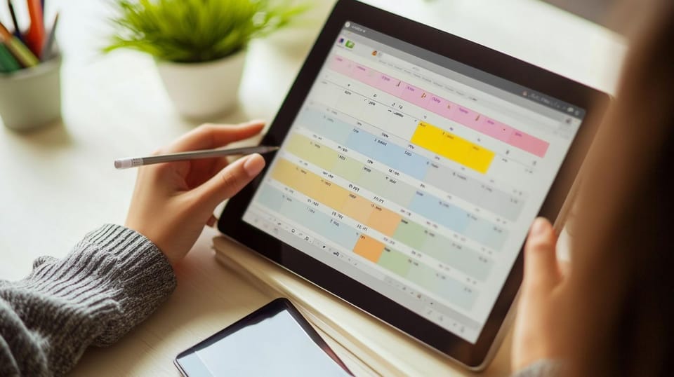
Customizing a digital planner is one of the most effective ways to make planning feel more consistent, more personal, and easier to maintain over time. When your planner looks cohesive and works the way you naturally think, it becomes less of a tool you “should” use and more of a system you return to because it genuinely supports your day.
The advantage is flexibility. You can change themes without starting over, reuse layouts without rewriting pages, and update your planning system as your routine shifts across semesters, new goals, and different seasons of life. This matters because digital planning is rarely static. Most people need something that adapts with them, whether they are building a study routine, managing work deadlines, or keeping track of personal habits.
In this guide, you’ll learn how to customize your digital planner with brushes, fonts, wallpapers, and stickers for visual cohesion and real, everyday use.
The Role of Personalization in Customizable Planners
Why Personalization Boosts Engagement and Productivity
When you customize your planner, you create a sense of ownership. It becomes your space. That small psychological shift makes you more likely to come back to it daily, because it feels less like a system you’re forcing yourself into and more like a routine you built for yourself.
A cohesive setup also helps your brain process information faster. When your headings look consistent, your icons mean the same thing every time, and your colors follow a pattern, your planner becomes easier to scan. This reduces friction and unsticks the brain so it can focus less on patterns and more on the information therein, such as meetings you can’t miss or what you need to study.
In this way, aesthetic notes are more than a year-long fad. Customizable planners with a clear hierarchy, spacing, and emphasis make it easier to absorb information because it's organized in a way your brain recognizes quickly.
Identifying Your Unique Planning Style
A cohesive setup starts with understanding the kind of planning you naturally use, rather than forcing yourself into a system that looks good but doesn't fit your routine. Rather than scrolling down “aesthetic goals” on social media, prioritize finding your own style.
Here are a few common ideas to help you find your customizable planner style:
- Minimalist and clean: neutral colors, simple headings, lots of whitespace
- Vibrant and energetic: bright palettes, bold titles, fun icons
- Whimsical and cute: doodles, Hello Kitty washi tape, playful layouts
- Professional and structured: muted tones, undated diaries, functional labels
- Creative journal-style: mixed media, emotion stickers, mood tracking
Once you understand the style that suits your workflow, it becomes easier to choose a layout that works best for you. This could mean using a weekly schedule template for study scheduling while keeping a more reflective journal section for personal routines, or building a personalized digital monthly planner that supports goal-setting without overwhelming your daily pages.
Choosing the Right Brushes to Enhance Your Planner
Popular Brush Styles and Their Impact
Brushes can shape the tone of your planner more than most people expect, because they influence how headings, dividers, and emphasis markers appear across your pages.
Here are a few popular styles:
- Calligraphy brushes: perfect for titles, quotes, and soft handwritten vibes
- Watercolor brushes: great for backgrounds, mood trackers, and gentle accents
- Sketch brushes: ideal for doodles, icons, and casual journaling
- Geometric brushes: clean shapes and lines for modern layouts and boxes
- Highlighter brushes: practical for study notes, important dates, and reminders
Personalizing your brushes gives you structure without the rigidity of templates, so you should experiment as much as you like.
Combining Brushes for Cohesive Visual Appeal
The key to a cohesive planner is choosing brushes that work together without creating visual noise. A cohesive planner usually sticks to two to three brush styles max.
Try this easy formula:
- One main writing brush (your everyday pen)
- One accent brush (for headers or dividers)
- One decorative brush (optional, for flair)
For example:
- A clean pen + a mild highlighter + a soft watercolor wash
- A monoline pen + a geometric divider + a calligraphy title brush
Remember that the decorative elements remain secondary to the content; your primary focus is to get your thoughts and schedule in order. To that end, it may be better to err on the side of simplicity rather than use every brush you can download.
Selecting Fonts That Reflect Your Voice and Improve Readability
Key Font Categories for Digital Planners
Fonts are one of the most noticeable parts of customization because they shape how your planner feels at first glance. At the same time, fonts affect usability, especially if you rely on your planner for study notes, daily schedules, or long-term trackers.
Here are the main categories to explore when choosing digital planner fonts:
- Serif fonts: characterized by the small strokes added to the ends of letters, for a bookish feel
- Sans-serif fonts: without the strokes, evoking modernity and simplicity
- Script fonts: handwritten and expressive (best for headings)
- Decorative fonts: themed and aesthetic (use sparingly)
Choosing the right digital planner fonts often comes down to balancing personality with clarity. A planner that looks cohesive but feels difficult to read will rarely stay consistent in the long run, especially during busy periods when you need speed and structure.
Effective Font Pairing Techniques
Font pairing is one of the simplest ways to create a polished digital planner without adding extra decoration. A good font pairing makes for a clear distinction between headings and body text that’s both easy to read and great to look at.
A simple pairing that always works:
- Script or decorative font for headings
- Sans-serif font for body text
This is a classic because it keeps titles visually distinct while keeping your everyday planning readable, so your pages are consistent across monthly overviews, weekly spreads, and random notes.
Choosing Wallpapers to Create the Ideal Atmosphere
Wallpaper Types and Their Emotional Influence
Wallpapers set the mood of your planner. When you open it, the colors and graphics evoke an instant emotional response that sets the stage for the rest of your schedule.
Popular wallpaper styles include:
- Solid colors: calming, minimalist, great for readability
- Gradients: soft, dreamy, aesthetic without being distracting
- Patterns: playful and fun (dots, grids, gingham, stars)
- Illustrations: themed and cozy (florals, clouds, characters)
- Photographic backgrounds: bold and immersive, best for covers
Your wallpaper choice can also support your purpose. A soft gradient may help your planner feel less stressful during exam seasons, while bright patterns can boost motivation when you’re trying to build new habits.
Integrating Wallpapers with Other Design Elements
Wallpapers make for gorgeous backgrounds dripping with personal style, but they can become distracting when they scream too much personality.
To keep things cohesive:
- Match wallpaper tones with your sticker palette
- Avoid busy backgrounds behind heavy text
- Use light overlays if your text gets hard to read
- Keep one wallpaper style for the month (then change it next month)
A useful approach is to assign wallpapers by section, so your monthly pages follow one style while your weekly pages follow another. On the other hand, undated planners are great for custom timings such as semesters or seasons.
Using Stickers to Make Your Planner Uniquely Yours
Exploring Types of Stickers: Decorative vs Functional
Stickers are one of the most practical customization tools because they add visual structure while reducing the amount of writing you need to do repeatedly.
In digital planning, stickers are usually divided into decorative stickers and functional stickers, and the best setups tend to use a mix of both.
Decorative stickers:
- Frames, icons, characters, seasonal art
- Great for mood, creativity, and personal expression
- Perfect for journaling spreads and cover pages
Functional stickers:
- Checkboxes, labels, tabs, and appointment icons
- Ideal for routines, productivity, and organisation
If you use Goodnotes monthly planners, especially on the iPad, building a sticker library is a game-changer. Goodnotes stickers make it easy to drag and drop common elements (like “exam,” “deadline,” “gym,” or “payday”) without rewriting them every time.
And if you’re into journaling, digital journal stickers are perfect for creating themed pages that still feel structured.
Creative Sticker Layering and Theming
Sticker layering works best when it is done with intention, because too many overlapping elements can make pages feel heavy.
Here’s a custom layering method that keeps things balanced:
- Start with one main decorative sticker (like a banner or frame)
- Add a functional sticker on top (like a label or checkbox)
- Finish with one small accent (sparkle, icon, mini text)
For themes, you can match stickers to:
- Seasons (spring florals, autumn tones)
- Moods (soft neutrals, bright colors, undated planners)
- Projects (study grind, fitness era, travel planning)
When themes are consistent, your planner becomes easier to navigate visually because you start to associate certain colors and sticker styles with specific types of pages.
Elevate Your Digital Planning with Webudding’s 2026 Digital Stationery Collection
A customized planner setup is not only about style. When done well, it supports focus, reduces stress, and creates a planning system that feels consistent and sustainable.
Whether you prefer structured planning, flexible journaling, or study focus, our collection includes planners, stickers, and accessories that can be mixed and matched based on how you plan. From productivity to mindfulness, the right digital setup makes it easier to stay consistent.
If you’re ready to refresh your planning routine, explore Webudding’s 2026 collection and build a setup that feels inspiring, cohesive, and completely yours.
Comments ()